Microsoft Ventures | Web, Mobile design, Branding
Microsoft launched an accelerator program to help 10 startups focusing on Connected Home and IoT. The companies were based on variety of platforms ranging from a mobile application, website, and physical device. (More infomation about the program and my involvement can be found at the bottom of the page) Read the article on GeekWire.
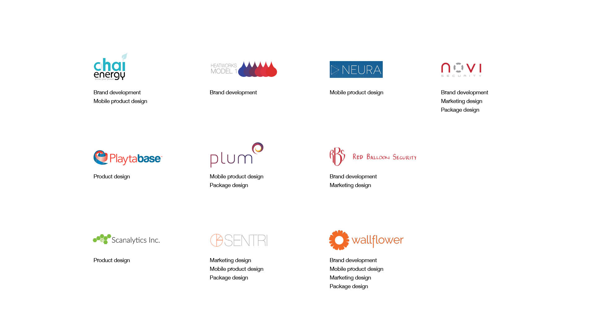
(Image: Logos of all the companies who went through the program and design work that was accomplished)
Redesign to best target users
The goal for majority companies was to establish a reliable brand and identity that best represent themselves in the market and convey that through the product experience.
Case Study: Chai Energy
When Chai Energy joined the acceleration program, they had a working prototype for both of the physical device and mobile application. They were hoping to redesign their current brand so that there is a consistent experience between the two and fit better for their targeted user.
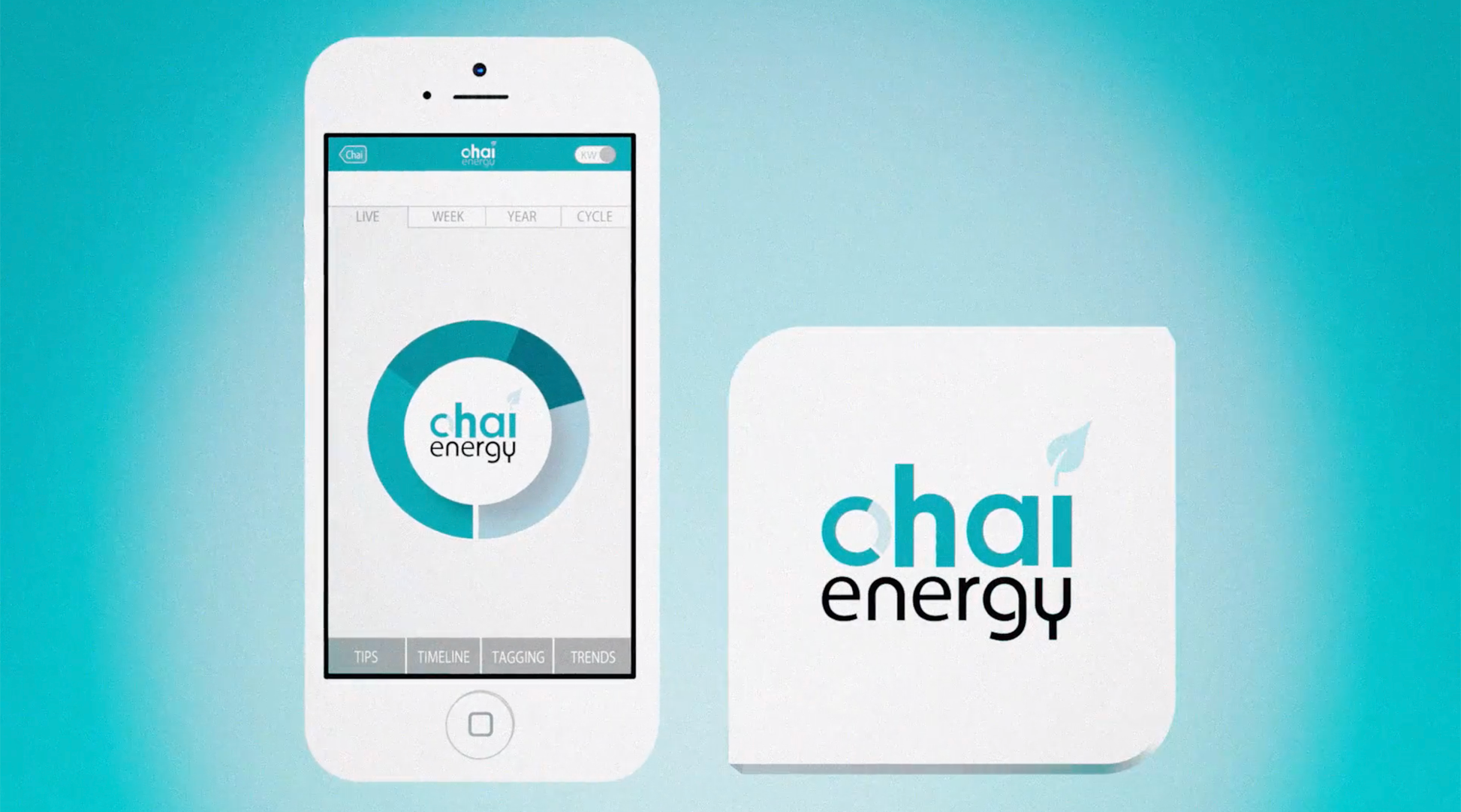
(Image: Chai’s original brand)
A little bit about Chai Energy
Chai Energy uses analytics to process utility’s Green Button Data and delivers directly to the user. Based on this, the application offers energy-saving opportunities and recommends rebates, incentives and programs, to help user save on their utility bill.
Approach
The overall color palette of the current brand was minimal, and the brand itself needed a fresh look. So I started with capturing the brand attributes and creating a mood board to bring clarity to the look and feel of the brand.
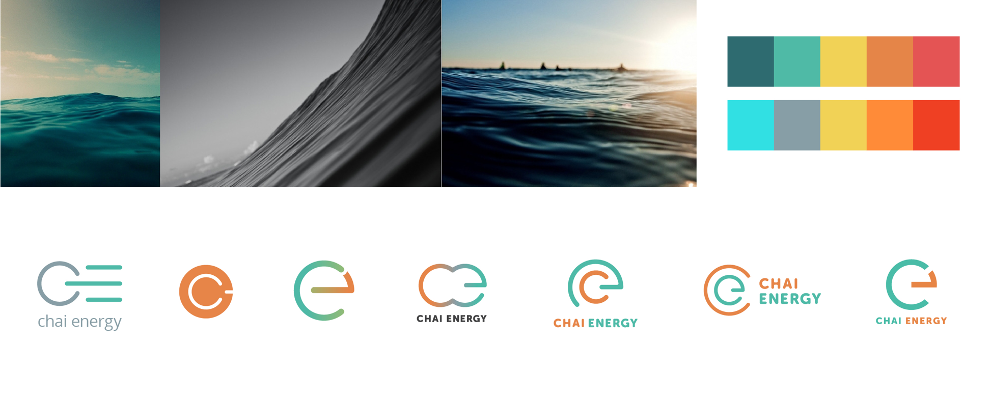
(Image: Images from the moodboard, updated color palette and evolution of the logo development)
Dashboard design
When user logs into the app, they first see the daskboard, which shows the current and history of energy consumption. The stakeholders wanted to have the original gauge look to replicate the physical power meter.
Information on the dashboard will cover how much money or power that the user is saving in real time, and based on that, it will calculate the bill.
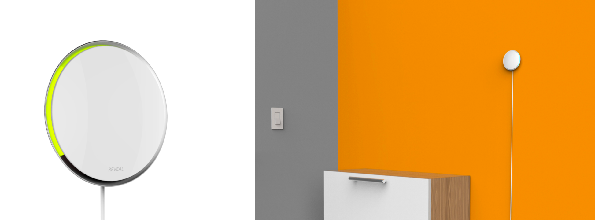
(Image: Physical device)
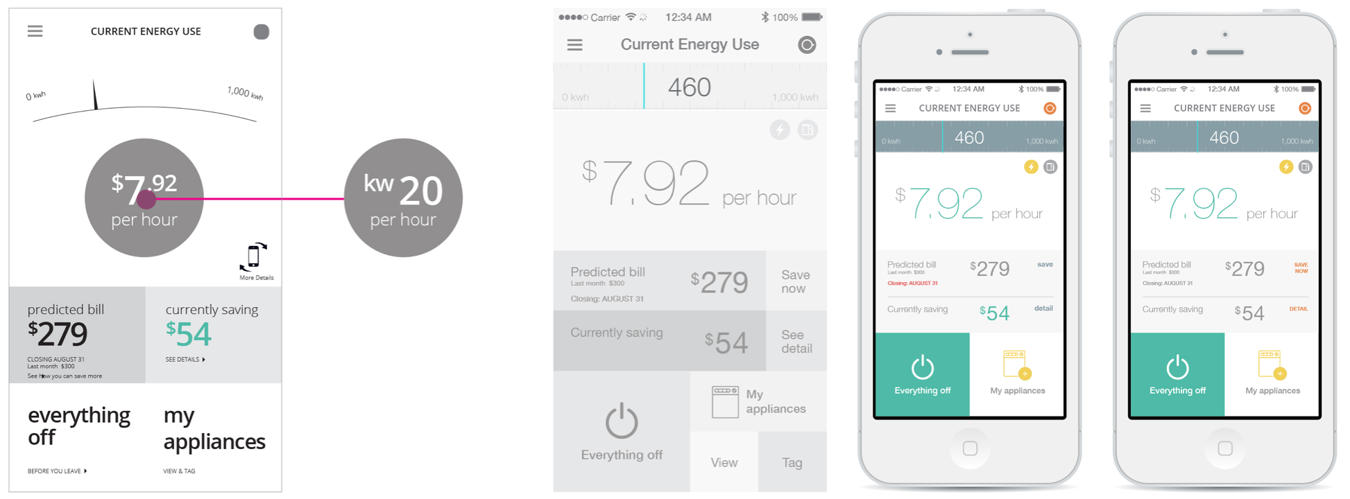
(Image: Initial wireframes of the dashboard)
(Image: More iteration on the visdual design)
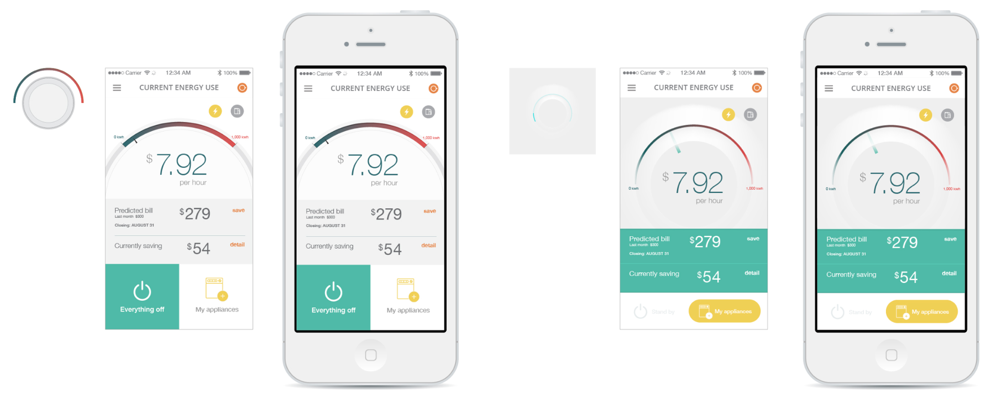
The challenge
The difficulty for the user was to visualize how much they are saving throughout a different range of time. Because of this, not only showing the current savings, but also allowing the user to see savings in a day, week, and month range was a valuable function to add.
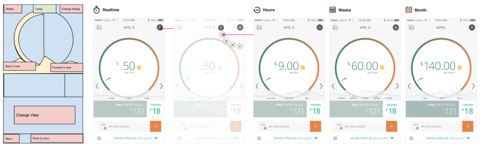
(Image: Initial wireframe and design for the updated direction)
Result/Impact
The new brand and the updated UI that represents the physical device and provides the right functionality was perceived well to Chai core team and their primary users.
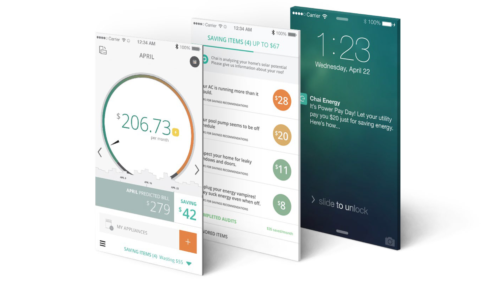
(Image: Screen mockups)
About the program
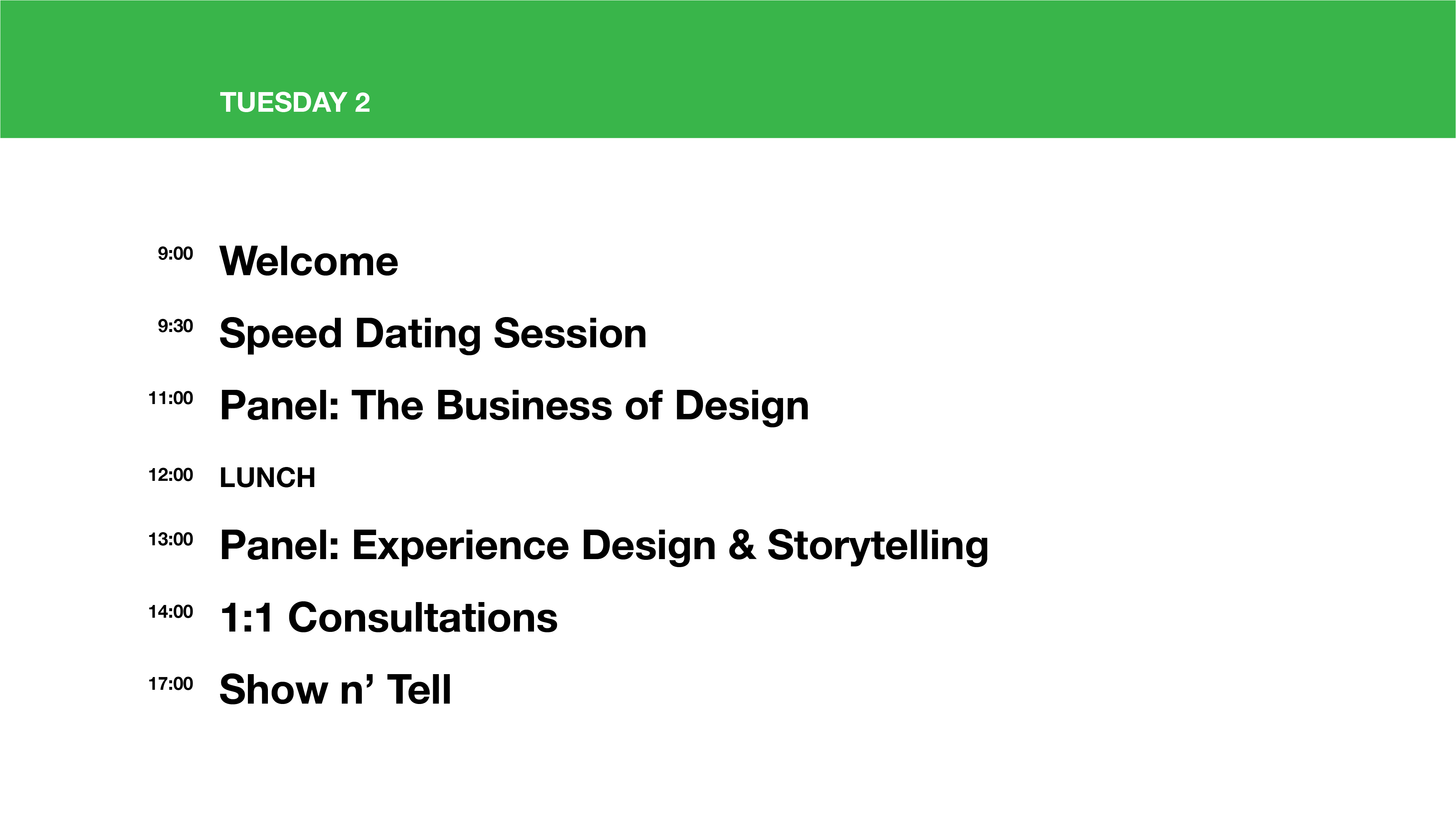
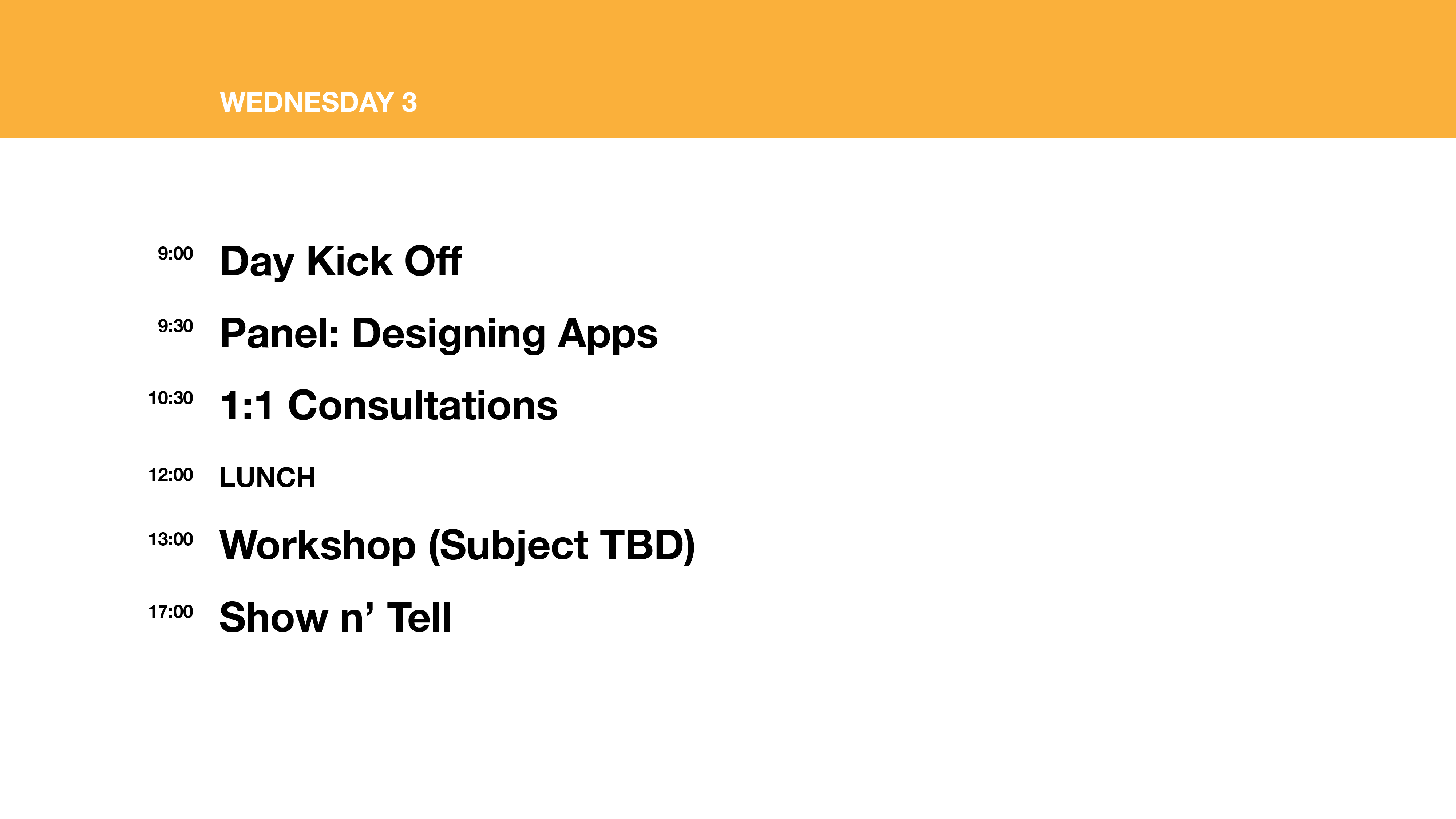
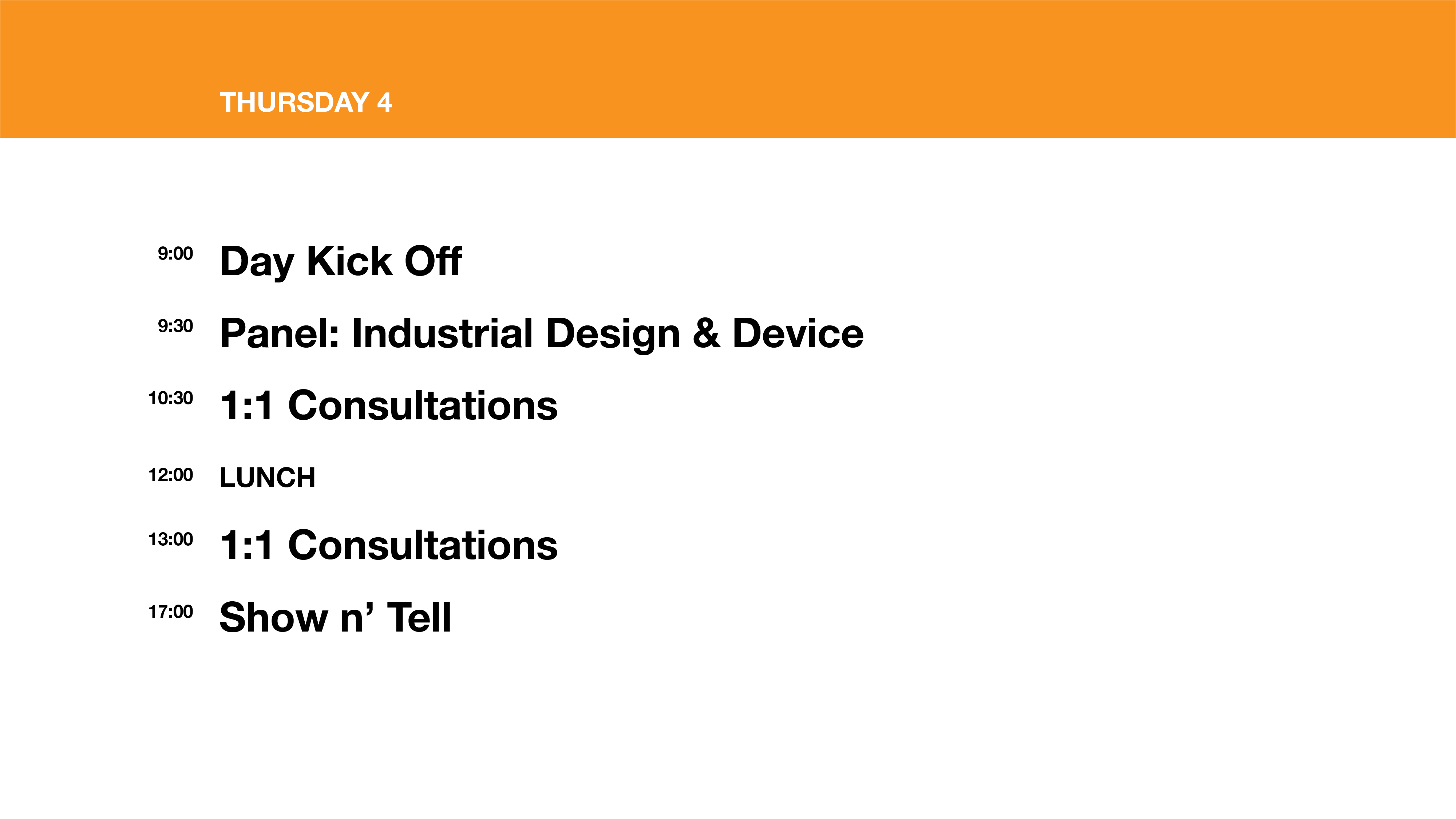
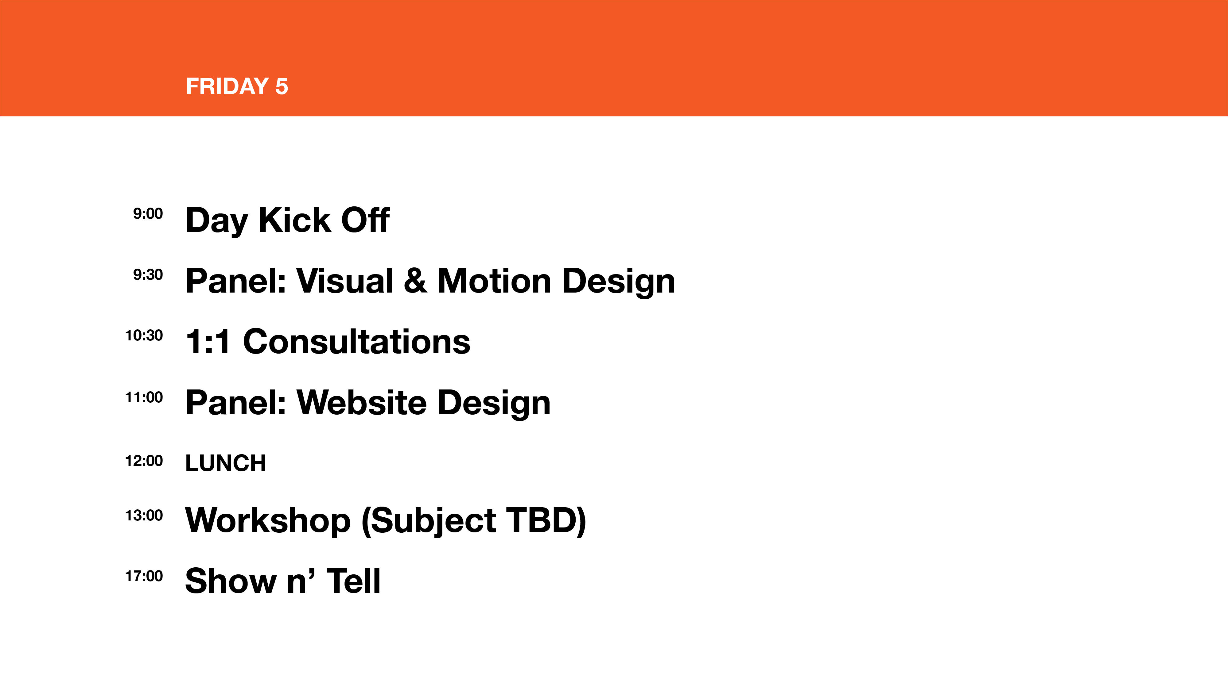
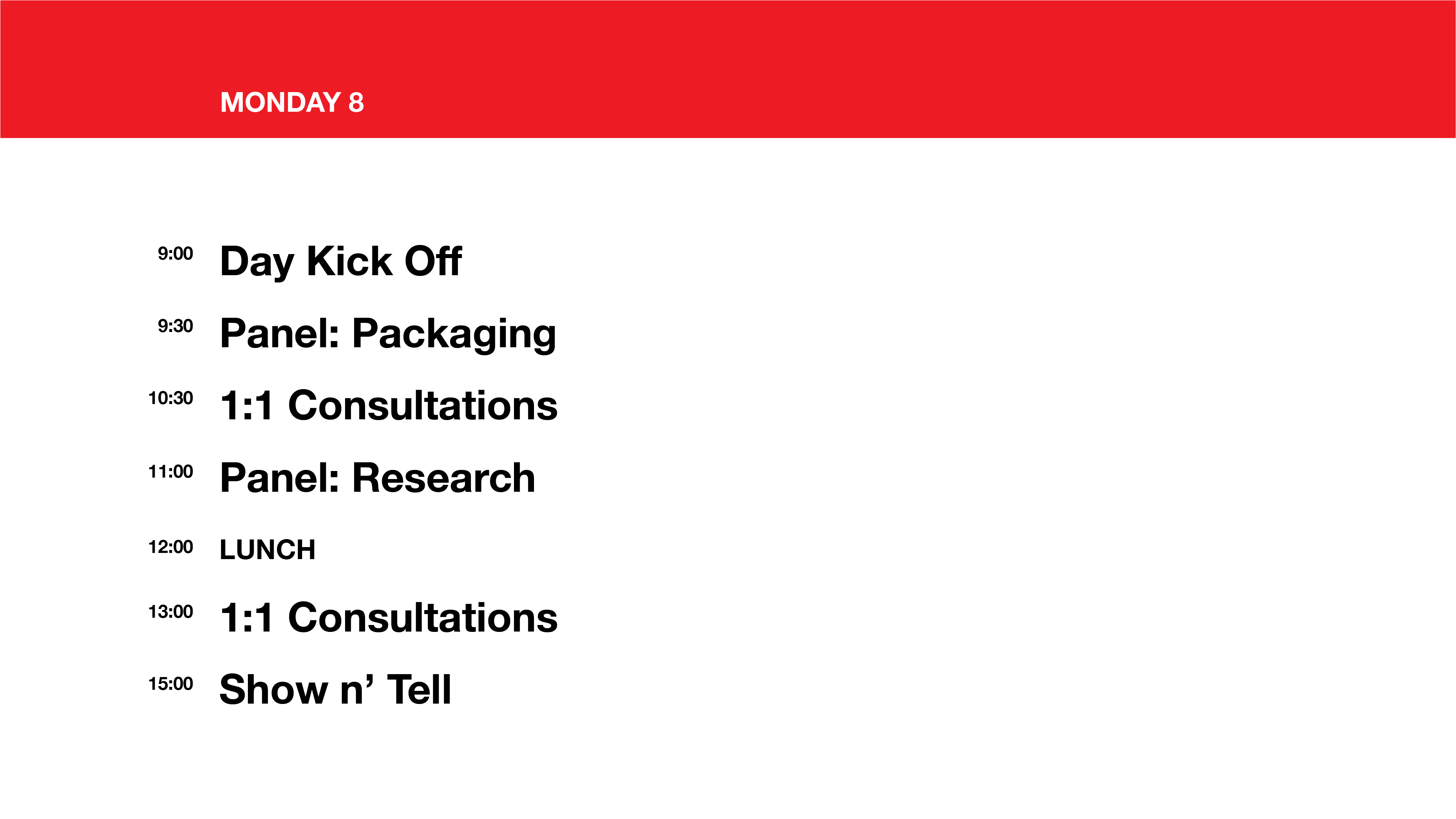
The accelerator program took approx. two months. The first week was planned to help startups to focus on design. Toledo 2 design studio (I was working with Toledo 2 design studio which is a vendor for Microsoft) facilitated the design week, which was consist of panel discussions covering different subjects that are relevant to each startup, 1:1 consultation to talk about design needs, and Show n' Tell where each startup present about themselves. Check out the full report designed by me!
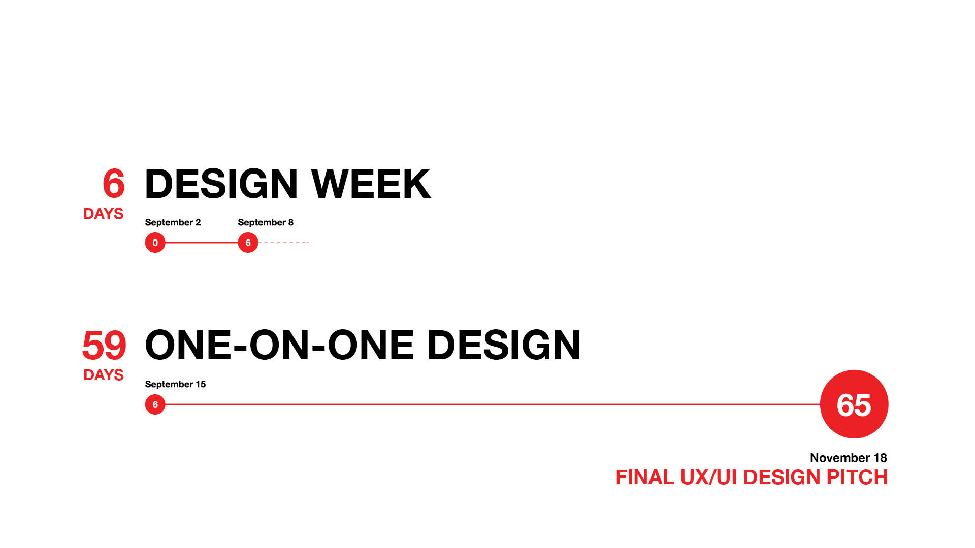
(Image: Snapshot of the program schedule)

My involvement
I worked closely with six startups during both design week and one-on-one design support days, Chai Energy, Wallflower, Plum, Novi, Sentri, and Red Balloon. On each startup, there was no designer. The team consisted of couple engineers and business owners. That's where I came in!
Chai Energy, Wallflower, and Plum was the company that I worked with most. I continued to work with Chai Energy after the acceleration program.
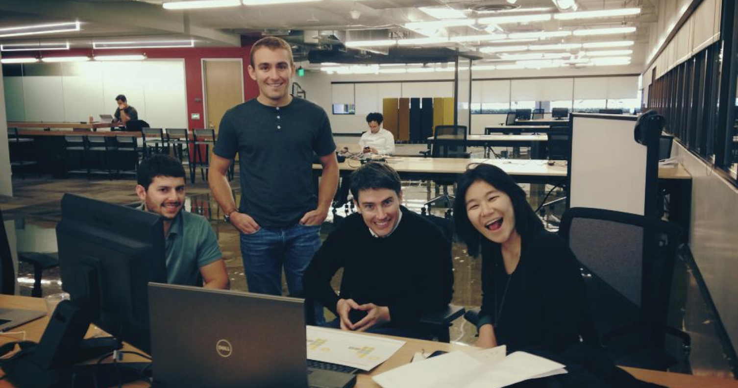
(Image: Picture with Wallflower team during the program)
Tools used: Illustrator