Stay.com | Mobile design
Stay.com is a people curated travel guide mobile application available in iOS and Android. The goal of the project was to create a Windows Phone version of the application to help expand the business presence in the market.
Delivering consistent user experience in multiple platforms
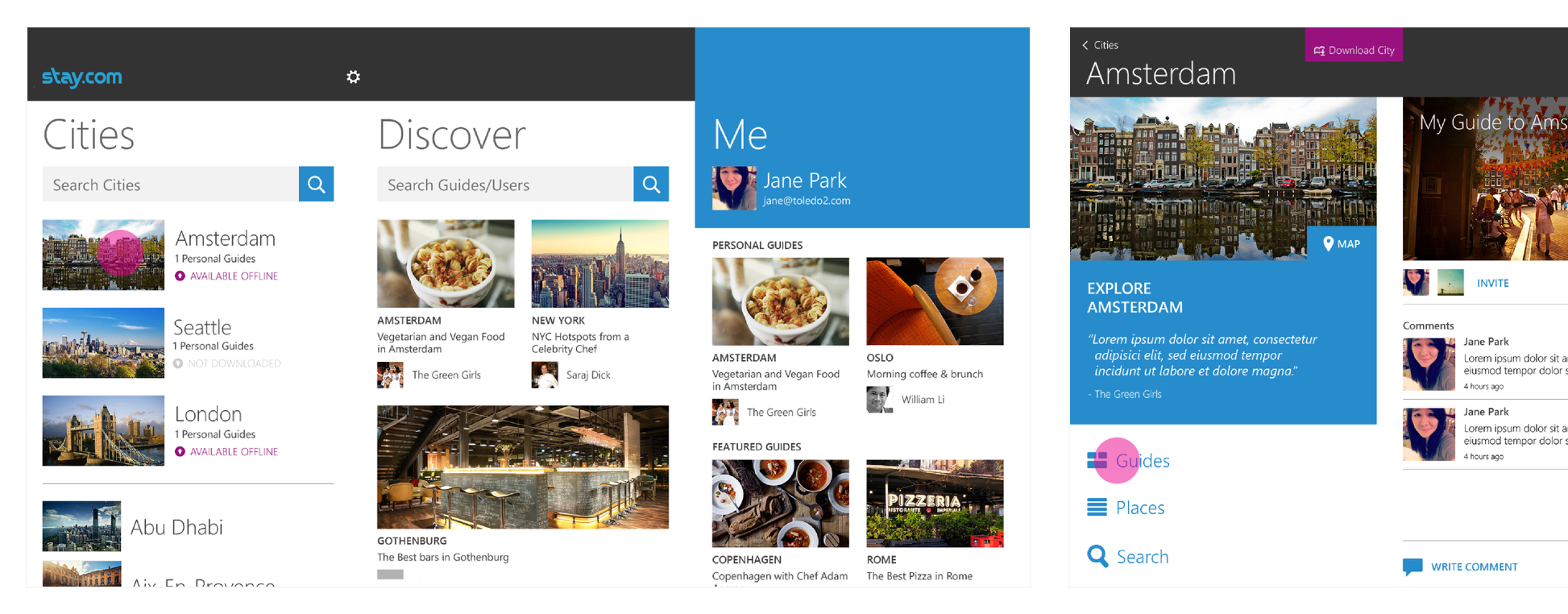
Layout of the UI and interaction model is different across multiple operating systems. It was important to understand the information architecture of iOS/Android application so that it can be trasnferred correctly to Windows Phone platform.
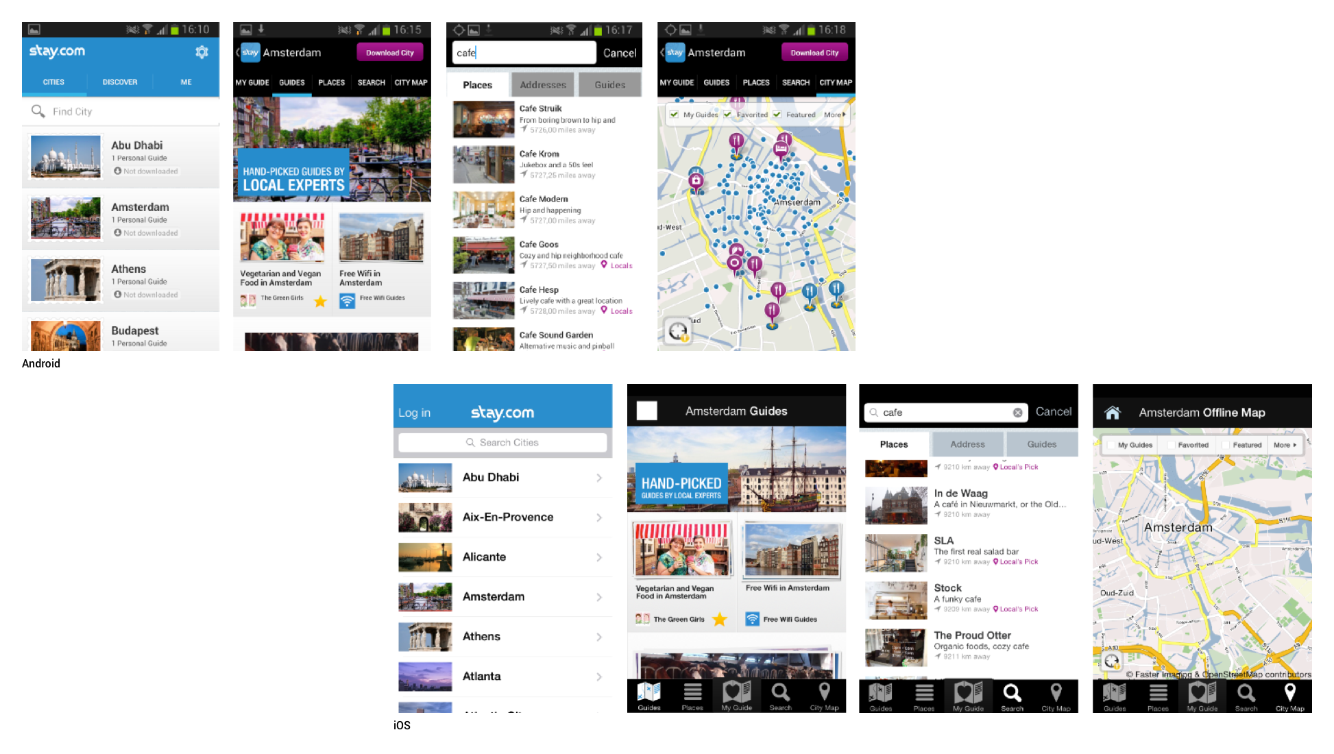
(Image: Screenshot of key screens from Android and iOS version)
Approach
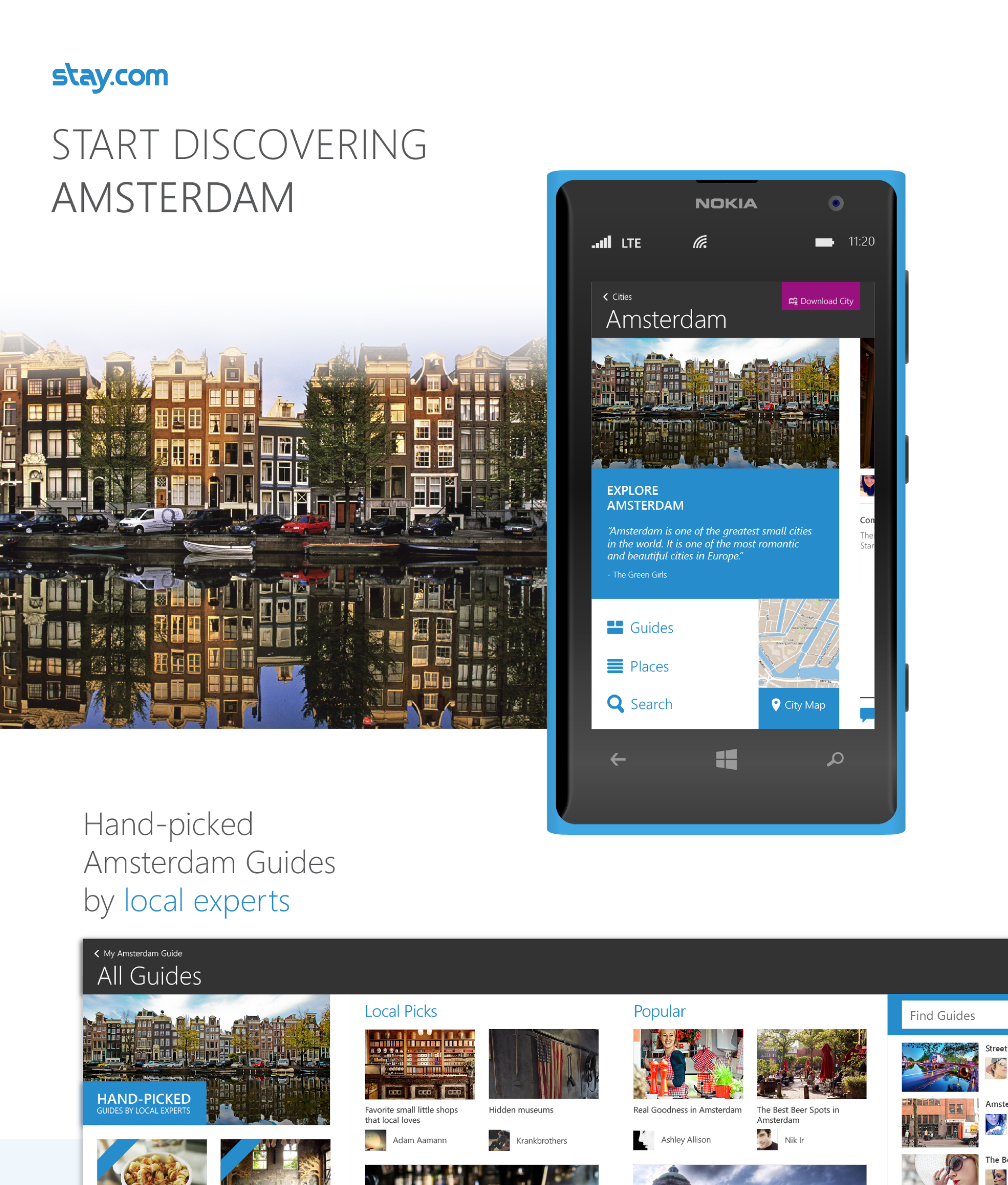
First we looked at the current screens and flows to understand the application better. We did this by laying out all the screens to show the hierary of information. Then, we started wireframing how it would translate in Windows Phone application. Multiple options were presented to the stackholders to determine what worked best. (See the final wireframe)
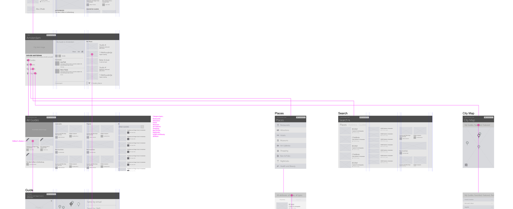
(Image: Snapshot of the wireframe layout)
The Challenge/Solution
The most challenging part of the design was how to bring consistent experience with the main navigation. Both Android and iOS has a similar grouping and positioning for the menu items, but for Windows Phone, menu items were normally treated in vertical layout and additional content was shown in the horizontal panes.
So, we re-organized the information architecture by exposing “My Guide” to the top level and kept other menu items accessible. In this way, user was able to view their curated guide for the city, which is most frequently used.
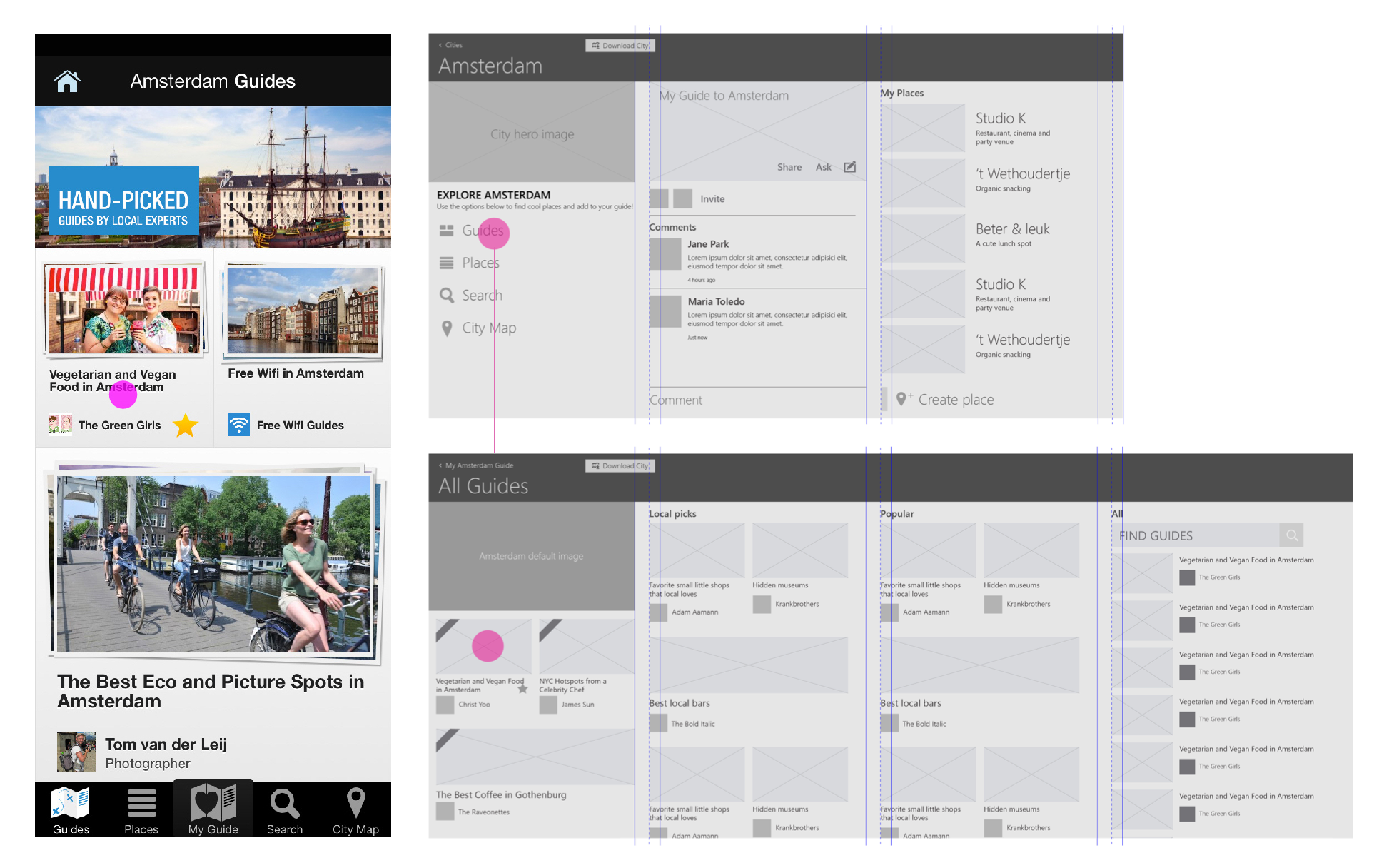
(Image: Comparison between iOS tool bar and final direction in Windows Phone)
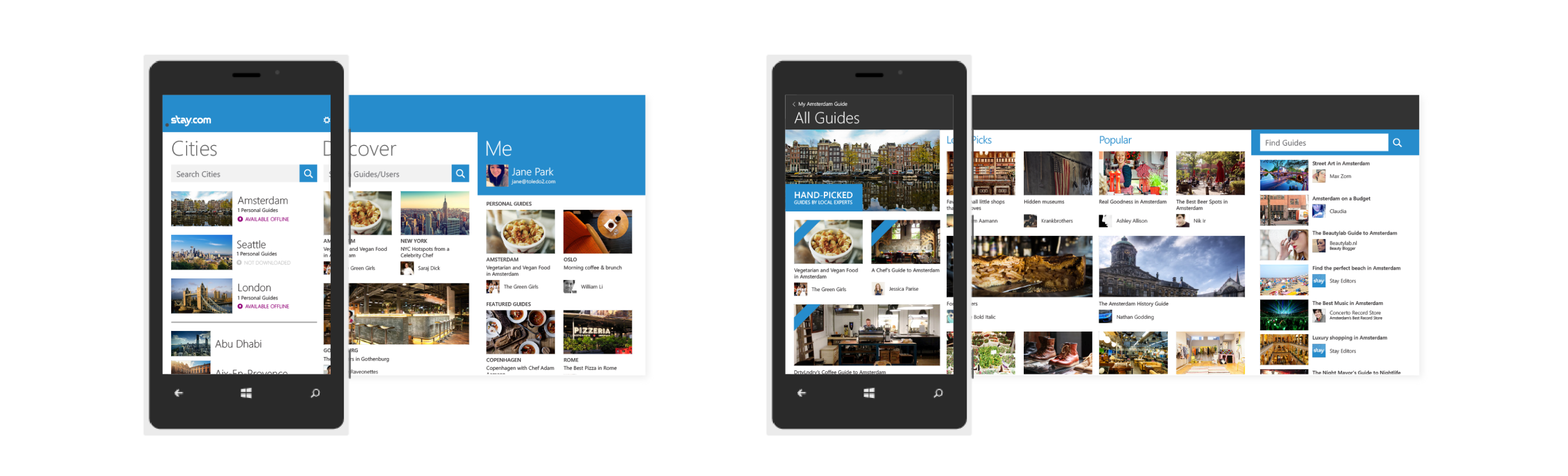
Visual Design
Same color palette was carried over, but the icons needed to be refrehsed to fit the Window’s Phone style (this work was not done by me). The most exciting part of the visual design process was taking adventage of the Windows Phone capability and designing the layout that can make the brand shine.
(Image: Brand moment on Me pane and the city guide pane )
Storyboard
Along with the design, I put together a storyboard that highlights the feature of the application as well as how the key screens looks on the Windows Phone OS. (Check out the whole storyboard!)
(Image: Snapshot of the storyboard)
My involvement
I was working as a full-time contractor for Toledo Design, where this project came through. I worked with project lead through the whole process. I was responsible for doing all the visual design and meeting the desired design quality that the customer requested.
Tools used: Illustrator