UI Tenents and Traps | Tool
UI Tenets and Traps is a tool that enables researchers and designers to do the heuristic evaluation on the design. This helps identifying usability problem in early stage of product development. Tenets describes attributes of good user interface design and Traps describes common, detectable problems that degrade good design.

Weak brand presence and inconsistent visual design
The old card deck is consist of UI examples from multiple product references. This resulted in lack of consistency in overall branding due to the distinct look of each product.
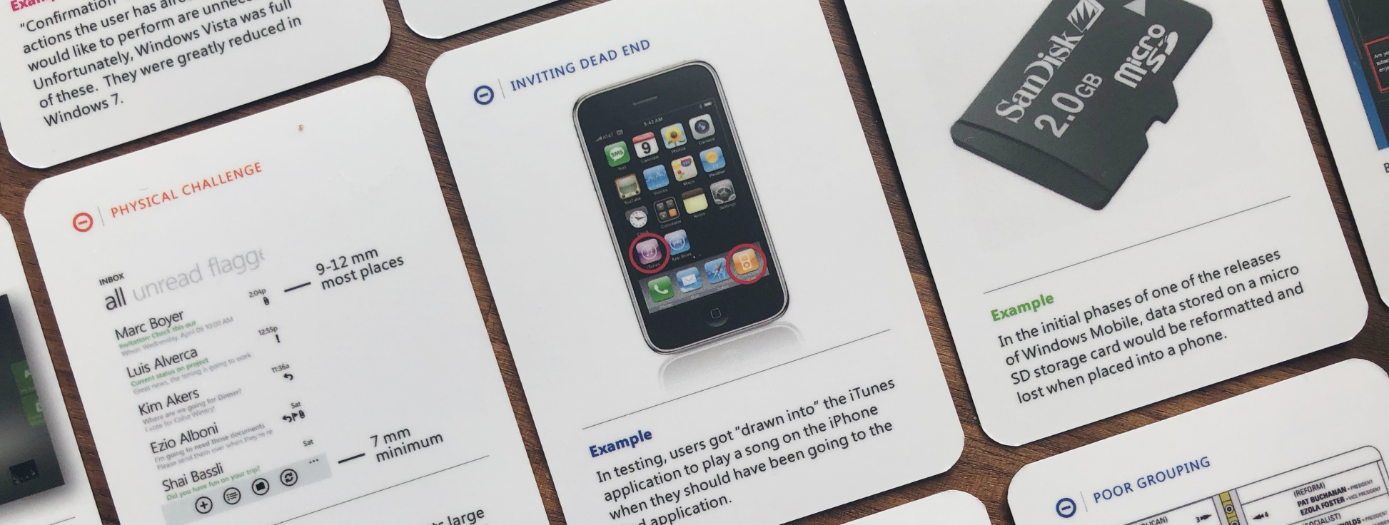
(Image: Old card deck that shows variety of examples)
Approach
The approach was to evaluate existing design elements and identity what worked and what didn’t.
Then, multiple design direction was explored and proposed to the stackholders.
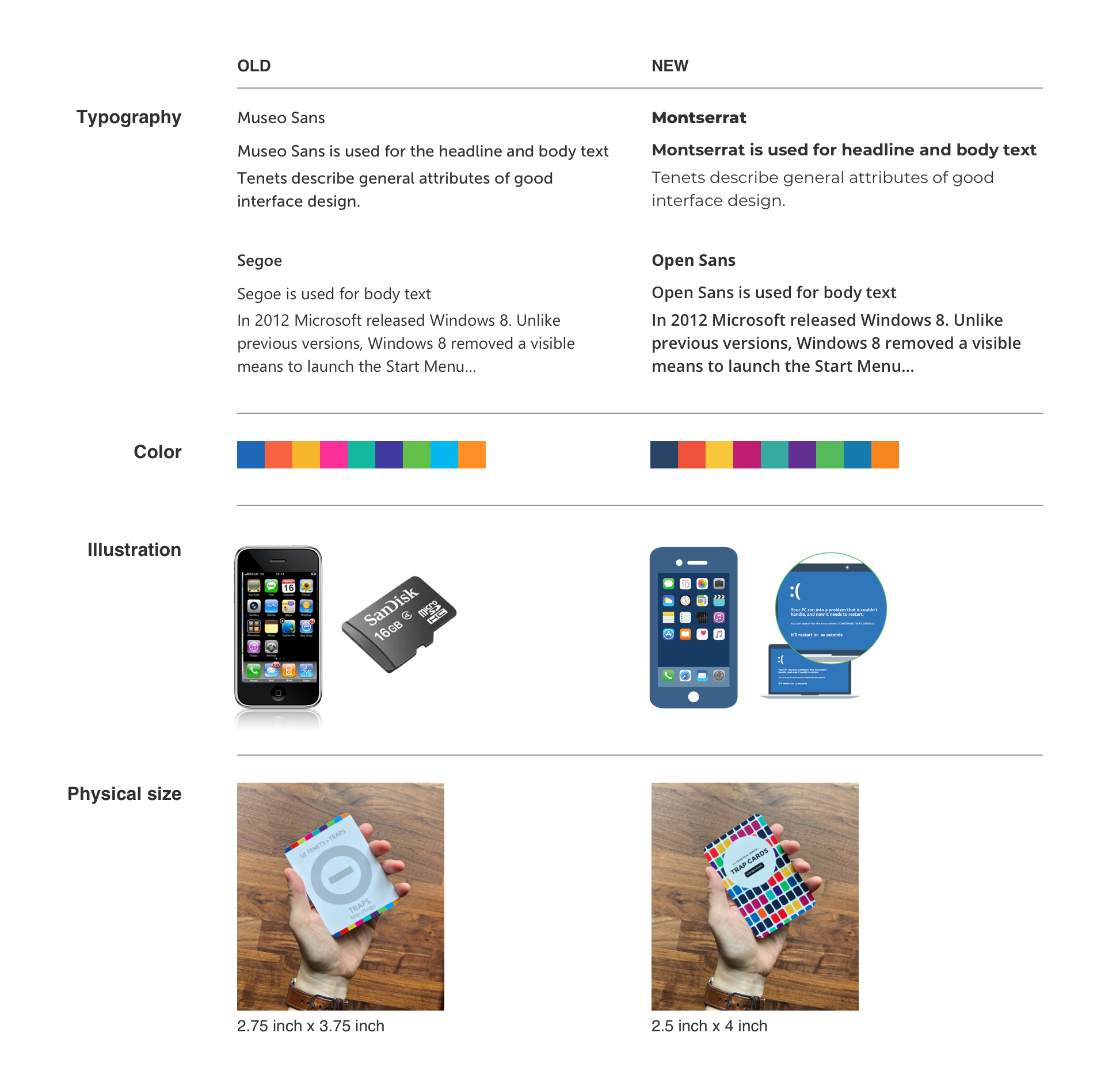
(Image: Comparison between old and new design)
Outcome/Result
All the product examples were updated to have the consistent look and the physical size of the card was modified to better fit users hands. Enhancement on the color palette and typography resulted in delivering the modern look and feel to the brand overall.
Fee free to check out the website!
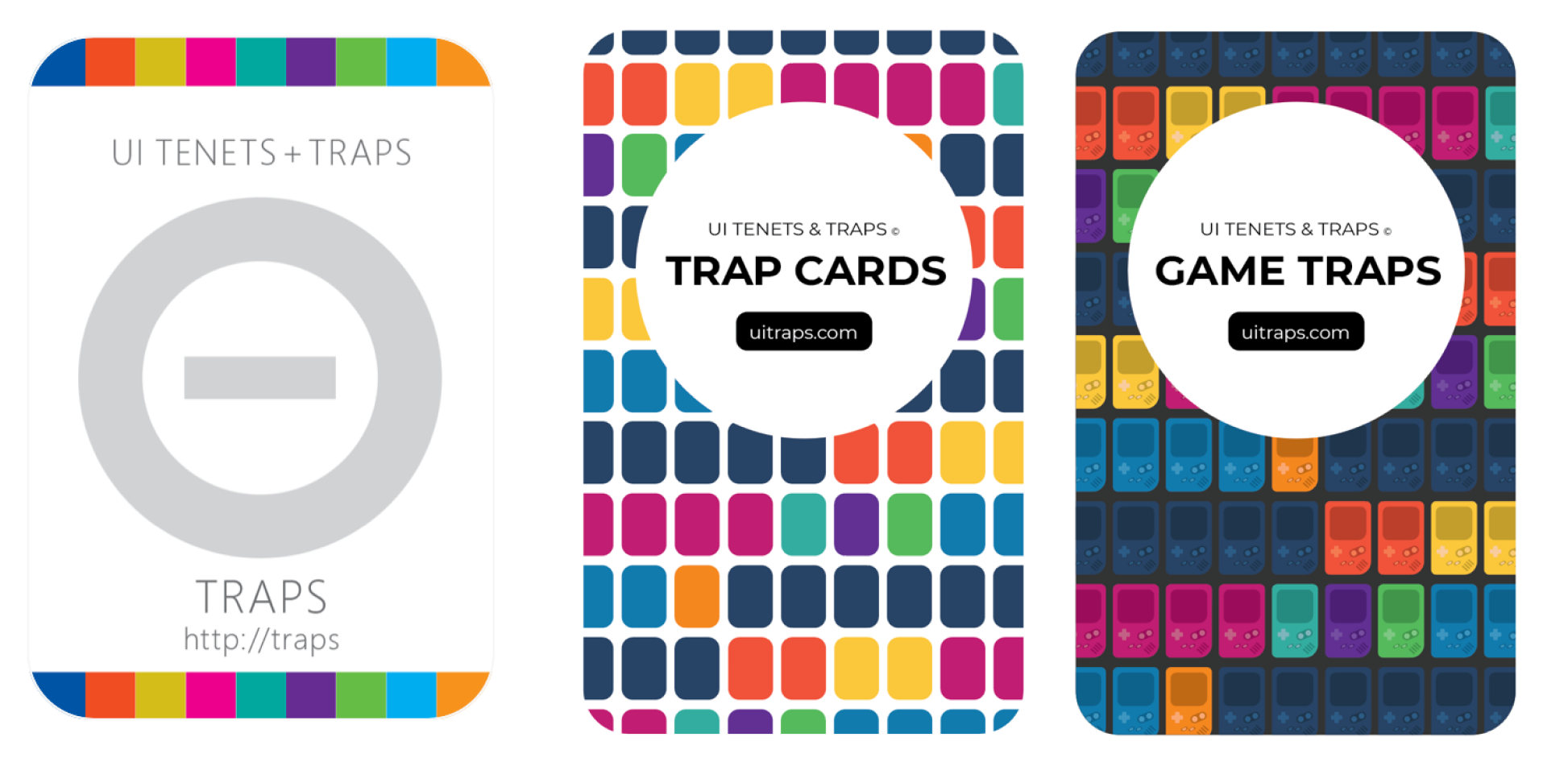
(Image: Cover design of the old, new card and POC for the game trap card)
My involvement
I worked with two researchers who are also the founder of UI Tenets and Traps tool. I was the only designer on the team for the redesign effort, which was applied across the physical card, website, and Power Point deck. I am continuing to work on the design for the upcoming book, poster and website enhancement in near future.
Tools used: Illustrator, Adobe Acrobat