Honeweyll Core User Interface | Design system
Honeywell Core User Interface Kit lets designer craft compelling experience and delivers high-quality designs that are recognizably Honeywell. The HCUI Kit is a Sketch file with an HDLS(Honeywell Design Language System)-compliant library of symbols and templates for rapid design in developing responsive web applications.
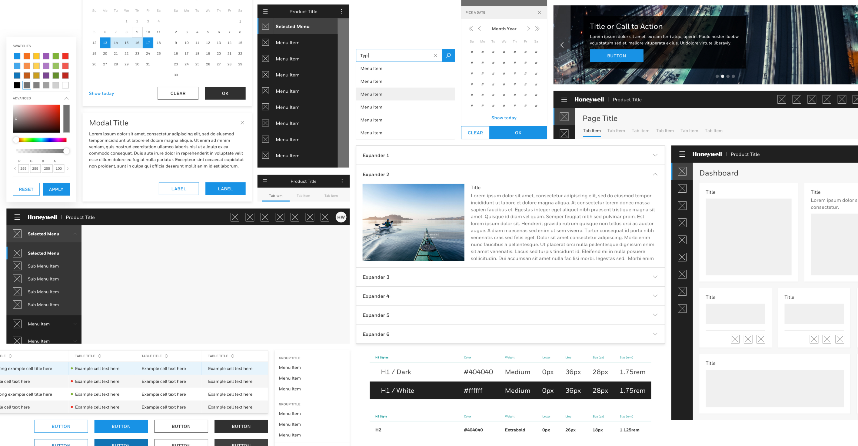
(Image: Collages of all components)
Longer product cycle time and inconsistent experience
Like many large companies, Honeywell has a tradition of solving software problems one solution at a time, resulting in less design and development reuse on projects, longer product cycle time and inconsistent experiences for customers.
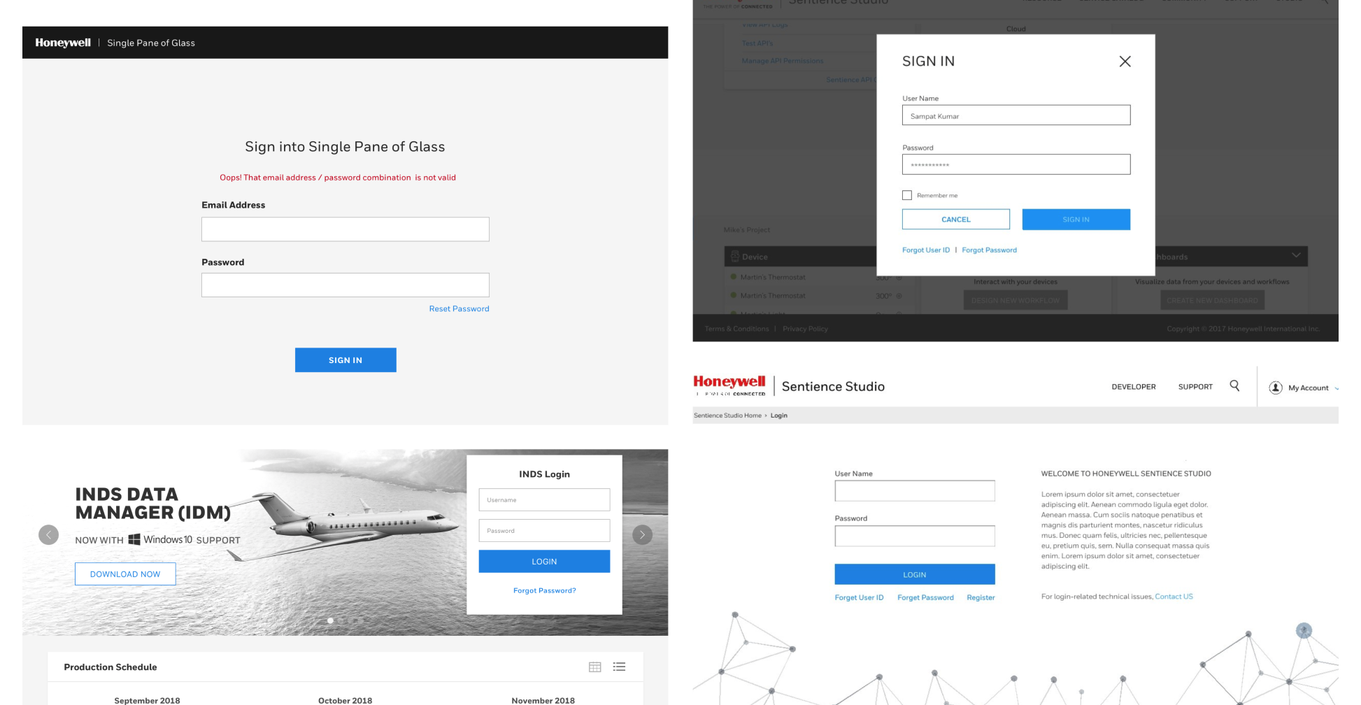
(Image: Variety of login screens)
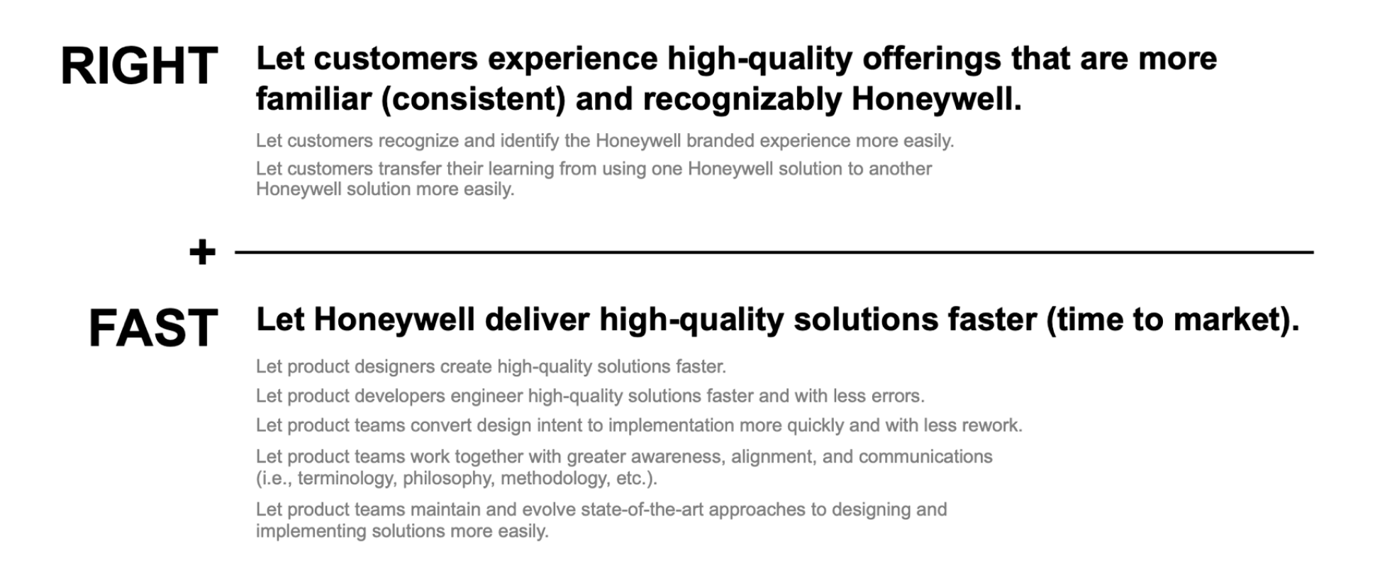
Approach
The need to leverage the innovations made across projects was evident. We set out to enable teams to build on the successes of others within our organization. We wanted to speed up the design and development of our software experiences while maintaining the right level of consistency.
(Image: Desired experience outcome)
We approached this by gathering design leaders from each business (Aerospace, Safety Productivity Solutions, Connected Buildings, Security, and more) and defined what are the common components/patterns across and what are not.
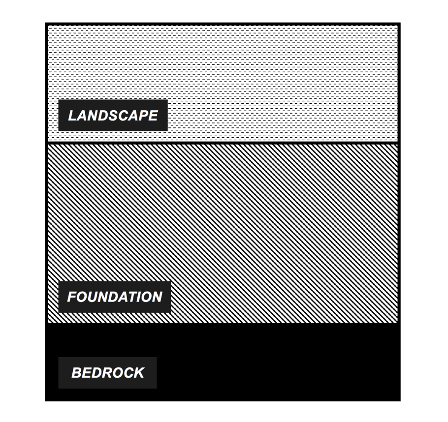
(Image: Architecture of the Honeywell Core User Interface)
LANDSCAPE
Some elements may be unique or special. But these items can still be leveraged by others across the company. i.e. Route map
FOUNDATION
Some elements are less to do with brand but are hard to make from scratch. These items can be somewhat frequent and may benefit from consistency so they can be easily leveraged across many offerings. i.e. Notifications, modal, and wizard
BEDROCK
Some elements need to be the same across experiences. Things that are frequently used and that help drive brand recognition will be standardized and unchangeable across offerings. i.e. Login, app switcher, and chrome
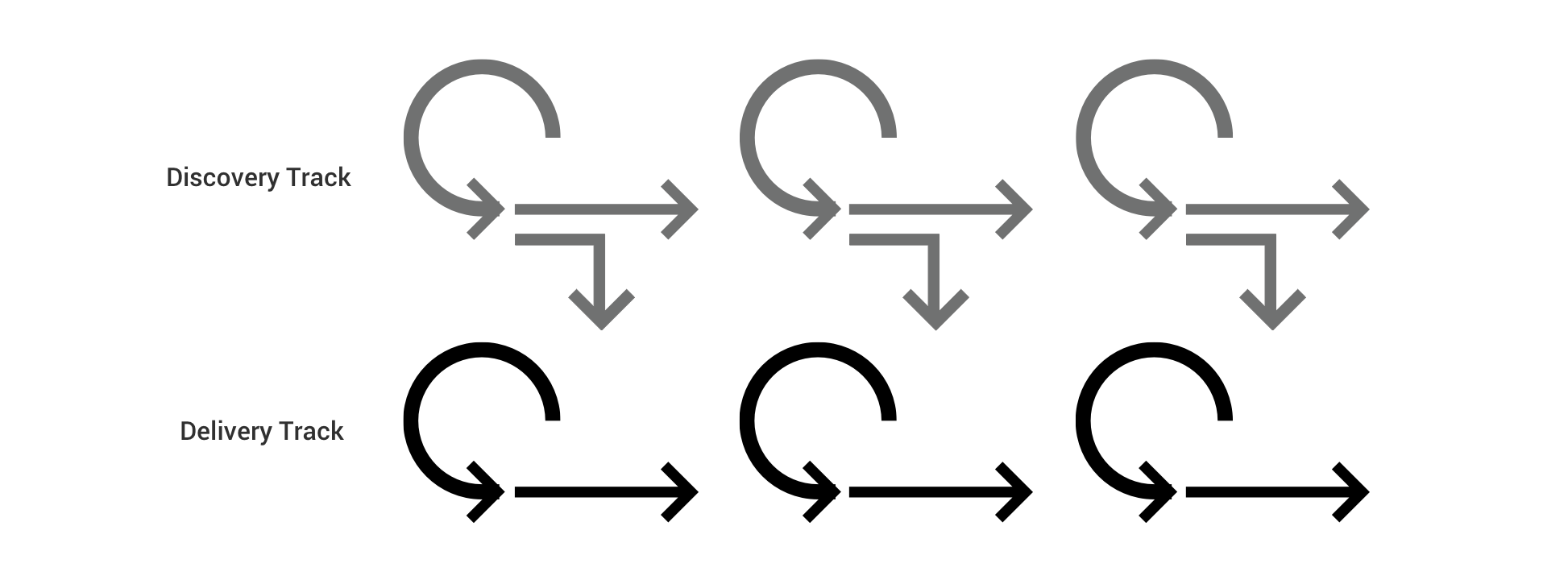
Dual track aglie process
We followed a user-centered dual-track agile process, discovery and delivery track. The Discovery track focuses on understanding component and pattern needs from our targeted users. We did this by conducting research, consolidating prior designs and evaluating best in class solutions. Once the requirements and needs were clear, we design the UI component, pattern or style in the official Sketch file using source control. Our Delivery track focused on implementing all the UI components so that it can be used on applications across Honeywell. Our designer and design integrators worked with engineering teams to bring the components to life in code and published for developers to leverage.
(Image: Dual-track aglie process)
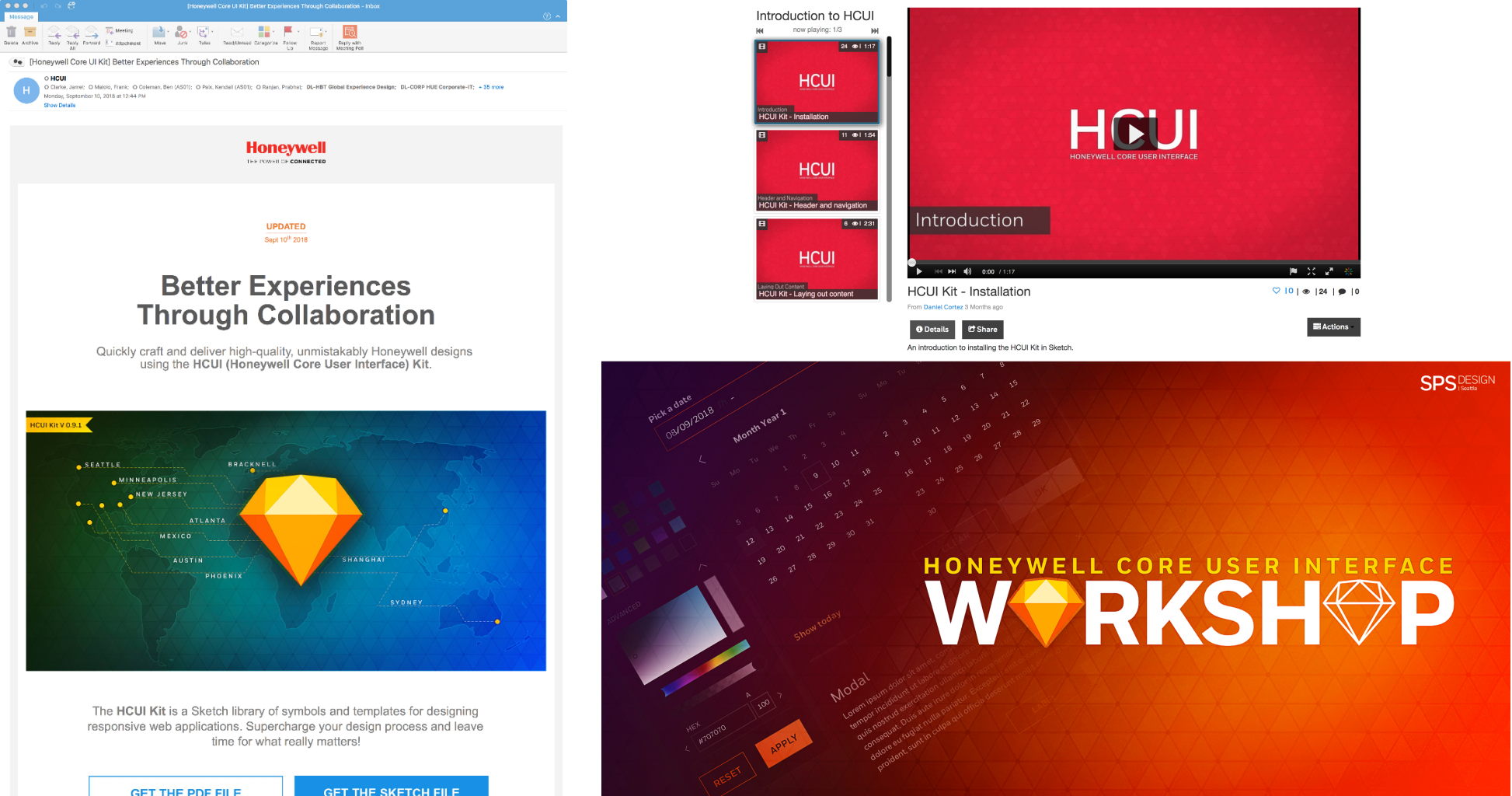
Institutionalizing & Evangelizing
Once the new components are released, the team made sure to communicate effectively by launching email campaigns, providing tutorial videos, and hosting HUCI Better Practice session, webinars, and workshops to guide designers and developers in Honeywell to adapt and use the kit. Check out the most recent newsletter!
(Image: Email campaigns, tutotial videos, workshop, and webinars)
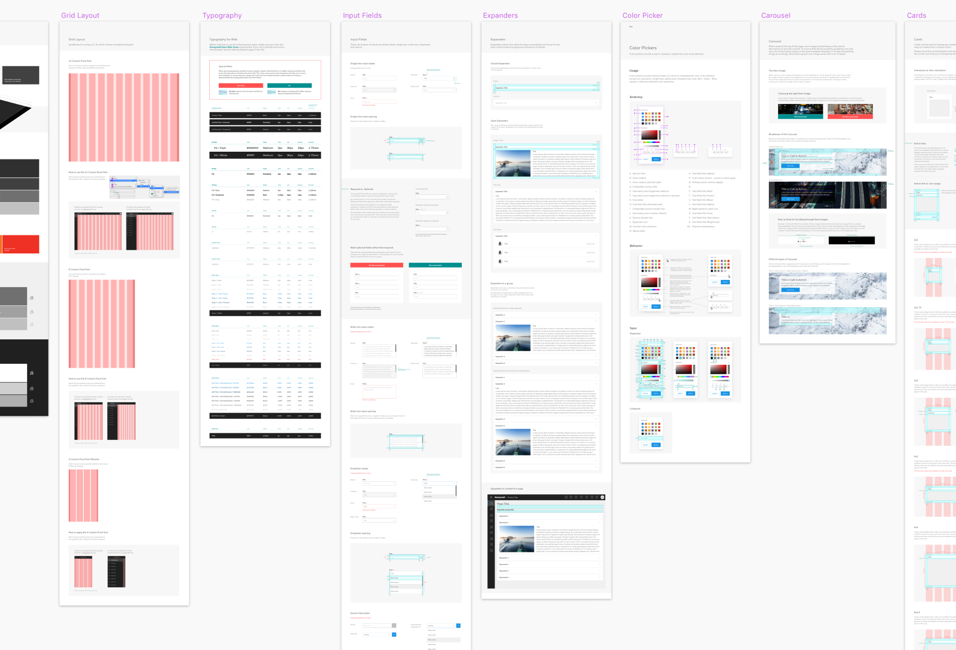
Result/Impact
Our team was able to deliver component library in Sketch that consists of both Bedrock and foundation.
This includes UI components, as well as common page templates. With the HCUI Design Kit, the designer was able to create applications quickly with consistency. All the components were also available as a code library for accurate implementation. Along with the Sketch file, we were able to consolidate all the icons so that there isn't any duplication within the same semantic.
To measure the success of the kit, we conducted a SUS (Standard Usability Score) score to keep track of easy of use and see the improvement every quarter. We also consistently conducted multiple usability testing based on component by interviewing designers and doing focus group studies.
(Image: Documentation of the HCUI Kit - Sketch file)
My involvement
Our core team consists of a program manager, a project lead, three experience designers, and a UX researcher. I was the project lead doing a lot of institutionalizing and evangelizing the kit across the company, planning future roadmap, and reviewing components crafted by the designers. Prior to being the project lead, I led the effort to establish a navigation and notification system. I worked very closely with other designers to meet good design quality on all the components and communicated with the development team to ensure all the components were implemented correctly.
Tools used: Sketch, Abstract, InVision, Microsoft Teams, Poppulo, and Jira.