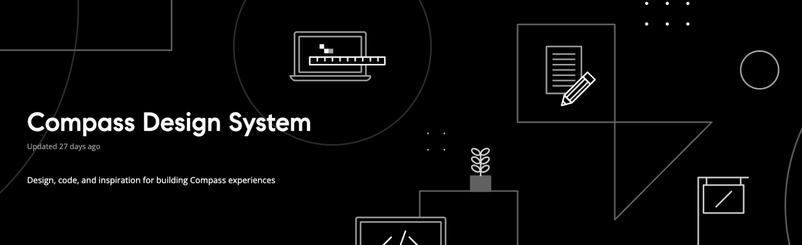
Compass Design System | Design system
The Compass Design System makes it easier and faster for designers and developers to build coherent, accessible user interfaces across all platforms by providing Figma and code libraries as well as a documentation site that contains guidelines and best practices in one place.
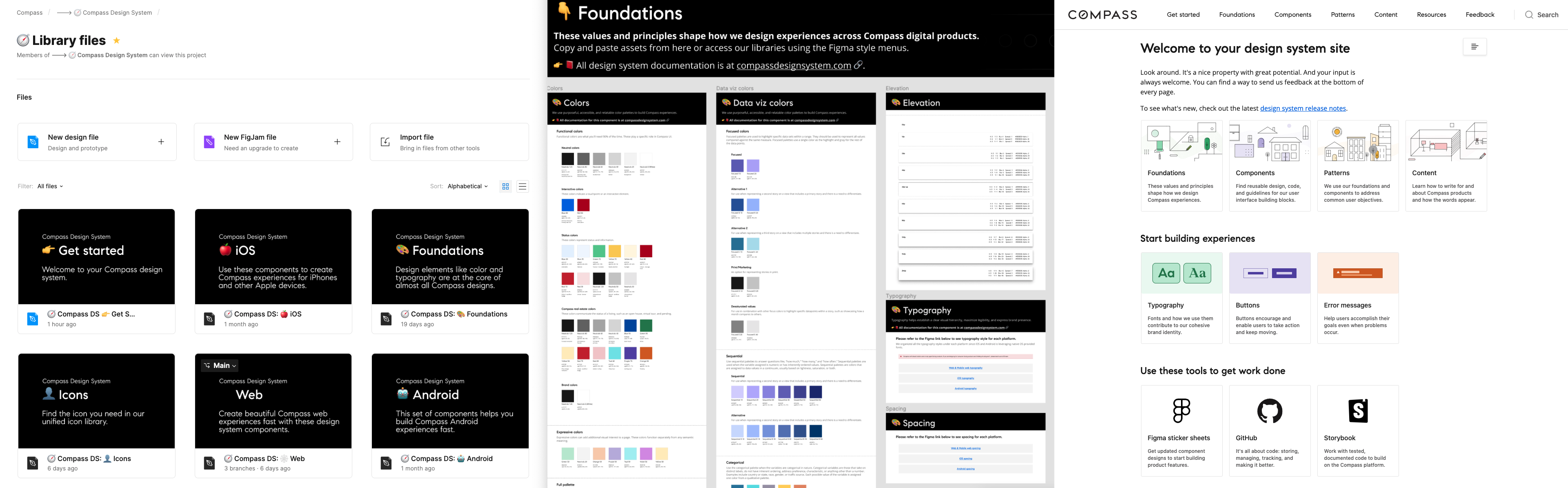
(Image: DS Figma libraries, Foundations libraries, and documentation site)
Goals & desired outcomes for Compass Design System
Like many other design systems out in the world, Compass Design System focuses on the following so that the feature teams can:
- Decrease time to delivery
- Simplify code
- Increase product coherence
- Enhance product quality
and moreover, we want to enable Compass to create experiences that follow Compass product design tenets, save time and operate efficiently, and most importantly offer consistent and delightful experiences to our agents and end customers.
The success of the Compass Design System is the continuous craftmanship of design, code, and documentation to work better together.
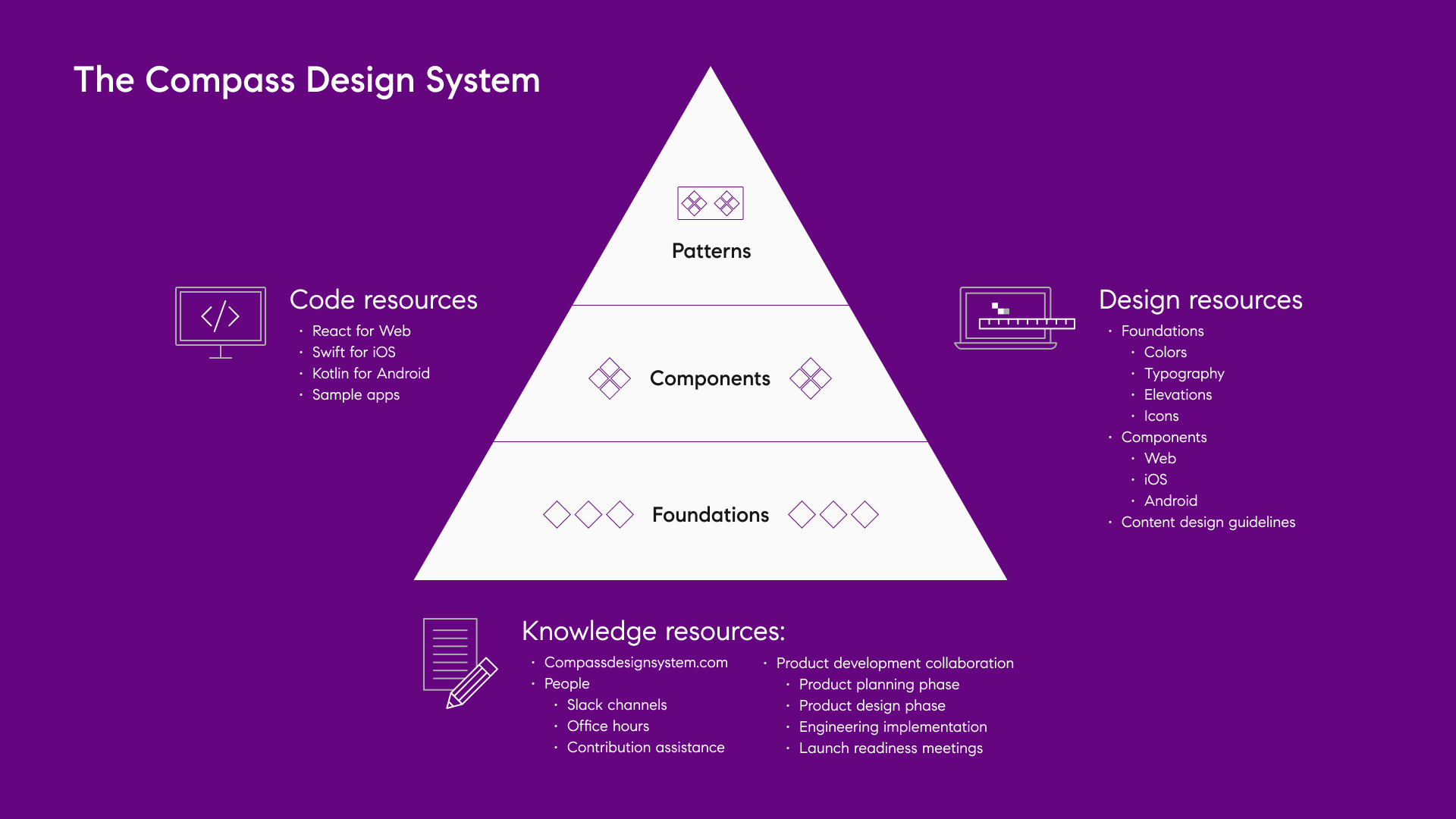
From the top of the triangle, Patterns are high-level turnkey solutions to complex but common interactions – think of sorting & filtering, error messages, and data visualization. Patterns are supported by components.
Components are the one level of abstraction below that: buttons, links, breadcrumbs, banners, and text fields. We don’t know how you’re going to use them, but they save you design & dev time by already being styled to Compass' brand language, highly tested & reliable, and accessible. Components are built using design tokens, which represent the foundation layer of the triangle.
The Foundations of the design system are the nearly-intangible elements that compose the Compass brand language: colors, fonts, text properties, shadows, and spacing. Foundations can also be leveraged by teams to create brand-new components or to customize existing ones.
For each of these three levels, there are code, design, and knowledge resources to guide the builders on how patterns, components, and foundations are used in our products.
Metrics
Web adoption
- 10% adoption to 90% adoption over 2 years.
- 100% of public-facing web apps in the last year were created using DS components.
- 1/5 of all web apps are using 25 or more DS components.
iOS adoption
- Over 2 months, 50% of the iOS components were refactored using the design system.
Android adoption
- 30 / 33 adopted in Jan. 2021
- 46 / 55 adopted in Jan. 2022
Total number of components (Total: 125)
- Web: 56
- iOS: 32
- Android: 37
Figma weekly inserts (yearly average)
- Web: 63.9k
- iOS: 16.0k
- Android: 4.8k
- Icons: 38.5k
Figma detach rate
~ 0.1% component detach rate (1 detach for every 1,000 inserts)
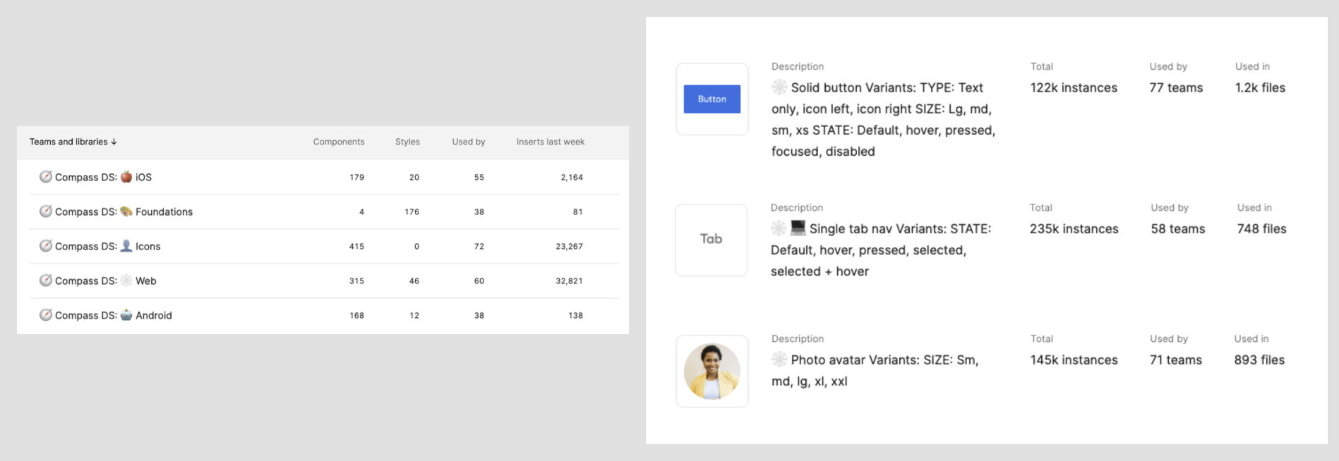
(Image: Figma metrics in Aug. 2022)
Highlighted projects
Cross-cutting initiatives/Design tokens
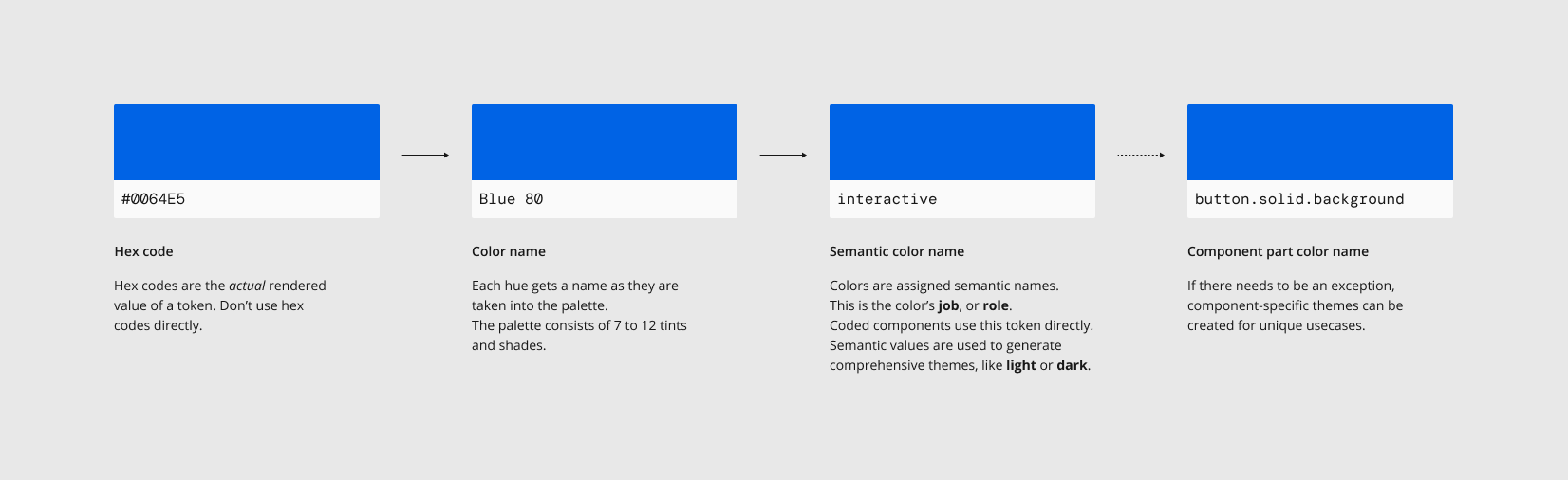
Design tokens allow for the rapid distribution of design language across the platform. Enabling theming such as 'Dark mode' or 'Client Theme' or 'Glide Theme,' design tokens also ensure that any current apps that need to deviate from our components can safely adhere to our visual language.
My main focus of the work was around cross-cutting initiatives:
- Color
- Elevation
- Client theming
- Typography
- Spacing
To view the highlighted process for Color and Elevation, please reference here.
Documentation site (www.compassdesignsystem.com)
A successful design system is Code, Design, and Documentation working harmoniously. Before this site, we had robust code repositories for web, Android, and iOS and design libraries in Figma, but we didn’t have a central place for documentation. This site is a central source that describes how to use the design system and helps builders create consistent experiences and streamline implementation.
A couple of tasks that I led along with other contributions to the site:
- Icon intake process
- Overall landing page’s thumbnails concept and development
- The visual design direction for each page and the overall internal process for refinement

Education
Design system and Figma training results in a significant impact on Design system adoption and reduces friction in design to development handoff. Also, increase the Figma proficiency of designers and developers.
The involvement that I had around education efforts:
- Involved with ongoing DS office hours and support via Slack
- Facilitated Compass Elevate course
My involvement
Our core team consists of one design director, one staff designer, four senior designers, a content designer, one engineering manager, and two senior web engineers. I worked across the organization to establish foundational systems (color, typography, elevation, and more) that create consistency across the Compass products.
Tools used: Figma, Zeroheight, and Jira.